


Stay in touch
Sign up here to receive updates from us on our latest projects, insights and news.
By clicking submit, you agree to receive communications from Architectus Australia. For more information, view our privacy policy and cookie policy.
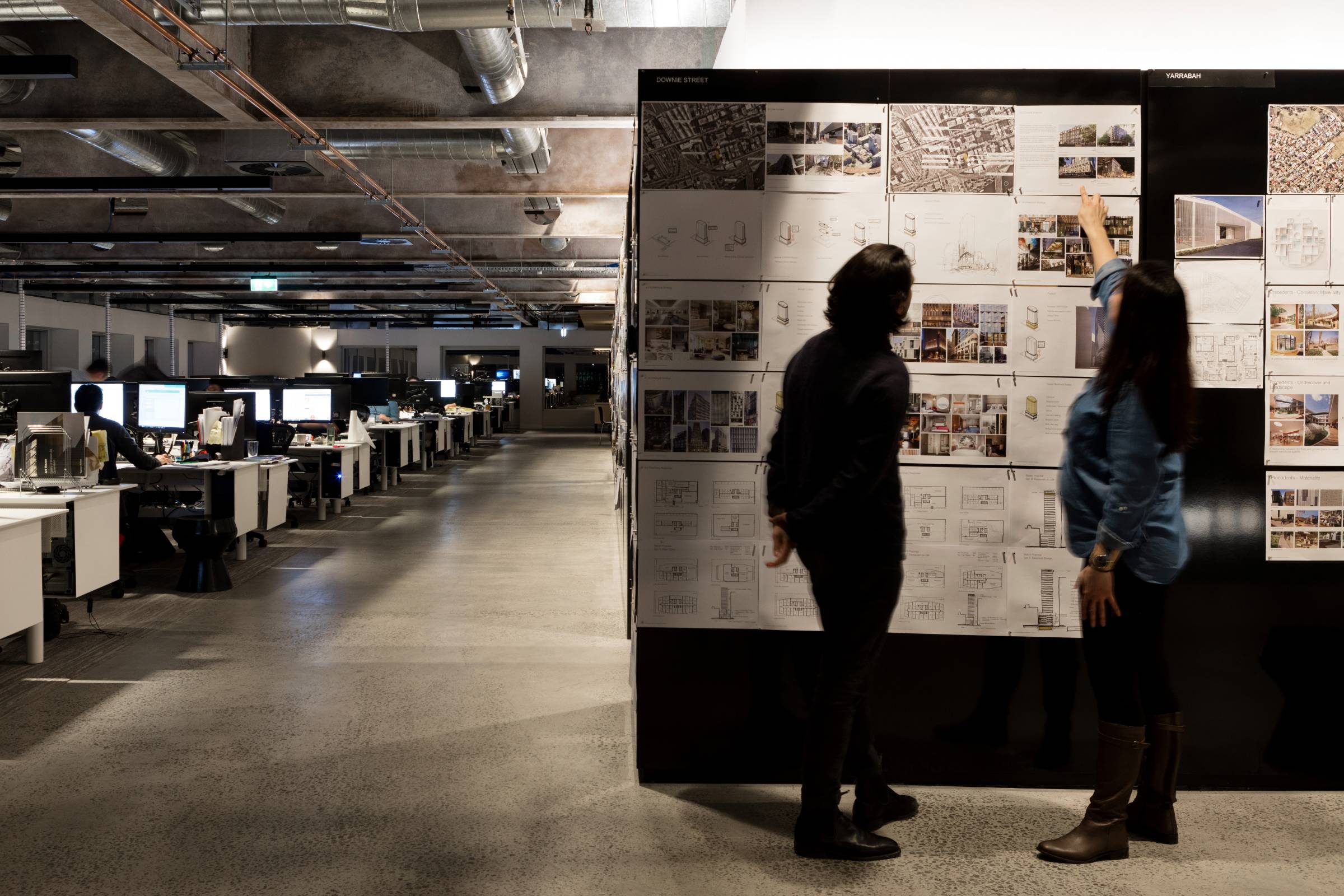
We are architects, urban designers and planners, interior designers, landscape architects, and digital specialists working together across nine Australian studios and three affiliated New Zealand studios.
Our work in the spheres of Environment, Social Impact and Governance is continually evolving to ensure we meet our significant responsibilities as designers.